Yonder
Yonder is the newcomer in a relatively mature short-term stay industry, defined by a familiarity that both the user and the host have with existing online booking tools. The challenge was to build a platform that felt second-nature for the user, yet also avoided the pitfalls of the Yellow Pages-style offerings from competitors like Airbnb, VRBO, and Hipcamp that dissatisfied users and hosts alike.
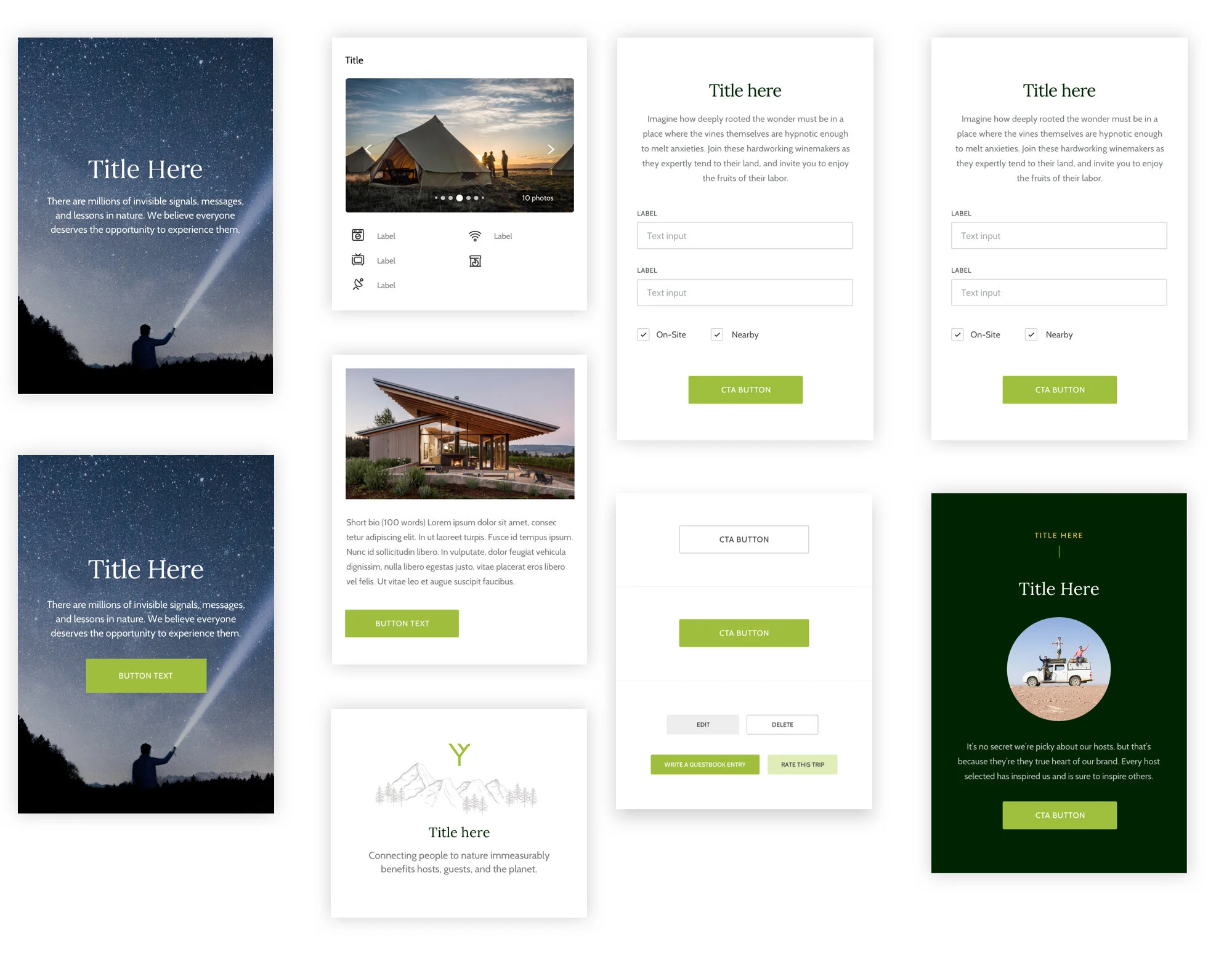
Yonder.com’s online booking platform for short-term nature-inspired stays embodies the warmth, richness and inspiration of the concept. From the ease of booking to the illustrations that meet you in moments when you need a breather, we created a platform that moves users to get outside and experience nature.
Client: Yonder
Assignment: Website & Online Booking Platform
Role: UX Strategy Lead
Agency: Bukwild
Let’s build something together
Have a cool idea that you want to bring to life? Get in touch and let’s talk shop.


